SaaS companies often take two approaches to competitor comparison landing pages:
- They neglect them entirely because they feel like they’re taking an unethical approach to marketing against their competition.
- They create them but do a poor job of making any real comparison. Instead, they overly fixate on discounting their competitors, not giving them credit where credit is due—or worse, focusing entirely on themselves.
When software companies don’t create comparison landing pages, they’re at the mercy of their competitors, dictating the narrative for prospects.
And suppose you do have a competitor comparison page that fails to draw a true (yet fair) comparison. In that case, you can’t create the narrative you aim to give prospects looking for the right solution among a sea of competitors fighting for market share.
Both of these scenarios aren’t optimal and may lead to poor conversions.
But suppose you can structure your competitor comparison landing pages so they serve you as a valuable asset in the buyer’s journey to help the right-fit prospects make decisions. In that case, you can transform these scenarios into a huge profit opportunity.
In this guide, you’ll discover how to do precisely that!
Before we dive in, here’s a quick primer on competitor comparison landing pages:
Competitor comparison landing pages are pages on your software product’s marketing site that compare your product with your competitors.
It’s a widely used and—when done right—an incredibly effective strategy for converting prospects who, based on their intent of comparing solutions, are at the end or near the end of their journey to becoming buyers or users of your product.
These pages are essential for helping your prospects understand whether your solution is the right fit for them rather than adding customers that will churn.
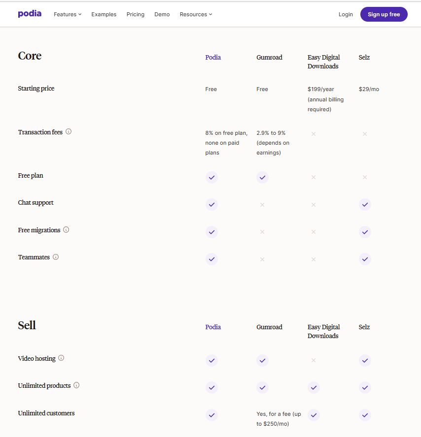
Here’s an example from Podia, listing its core features compared with those of its primary competitors, such as Gumroad. It gives users an easy-to-read snapshot of how its features and pricing compare so customers can make a more informed buying decision:
Why Are Competitor Comparison Landing Pages Important to Acquiring New Customers?
Competitor comparison landing pages allow you to control the conversation about how your product stacks up against your competitors.
Choosing the right solution from endless alternatives can be difficult for customers. They don’t have the time to sift through and evaluate dozens of options to understand what makes each product unique.
It’s your marketing job to perform the research and provide the best possible answer. If you don’t create a comparison page, they’ll still get their answers – but from your competition.
Here are the key reasons why you must have a comparison page:
- Help customers understand what makes your product different.
- Add your product to customers’ consideration.
- Increase conversion rates by targeting purchase-intent visitors trying to decide on a purchase or product switch.
- Control the narrative for prospects about how your products stack up.
- Help prospects in their research with clear and transparent information about your strengths and unique value proposition, which helps establish trust.
- Filter out poor-fit customers whose priorities are more aligned with your competitors’ products.
When you’re just launching your SaaS company and marketing your new technology, it can be challenging to describe what your service does concisely and eloquently.
While you’re finding the right words, competitor comparisons can help provide more clarity for prospects as they involve using more concrete examples. Comparative pages define what your product is by comparing it to who you’re like – and what your service isn’t.
How to Structure Competitor Comparison Landing Pages
Creating an effective competitor comparison landing page requires understanding your target market, product, and competitor’s product. You can make a price or feature-to-feature comparison page, but this isn’t compelling enough.
Below, we’ll explore the key components of a comparison landing page so you can structure them coherently and convert prospects into loyal customers.
Rank
Comparison pages provide long-term SEO value. These searches will generate a large volume of traffic. It’s critical to optimize the page and create a silo of content to rank higher on SERP.
Target the Right Keywords
Comparison pages can target a wide array of relevant keywords, and typically, comparison search keywords aren’t competitive to rank for. You simply have to outrank review websites.
Since comparison pages target specific search intents, you must focus on the right keywords to target, such as:
- Best / Top [Product Category]
- [Competitor Product] alternatives
- [Your Product] vs. [Competitor Product] (& vice versa)
- [Your Product] alternatives
- [Competitor Product] reviews
- [Competitor Product]
- [Your Product] reviews
- [Your Product] [Review Website] (e.g., G2 Crowd, Capterra, TrustRadius, etc.)
- [Competitor Product] [Review Website] (e.g., G2 Crowd, Capterra, TrustRadius, etc.)
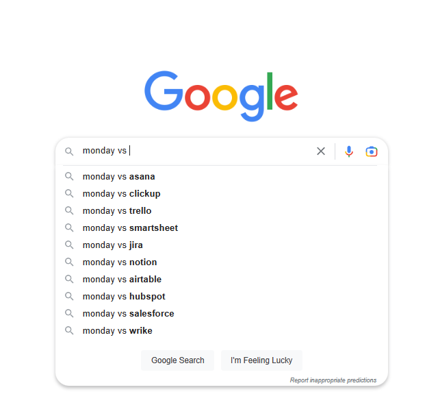
Google is also a gold mine for finding potential competitors or keywords to use. For example, by typing in Monday vs., I get a long list of competitors about which I can create a comparison page:
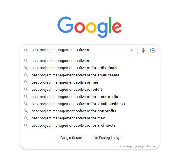
If you have a specific target audience, you can type “Best/Top [Product Category] For, and you’ll find the most popular markets looking for that category.
Here’s an example:
The idea is to cater to all prospects’ search intentions. If a person types the right targeted keywords into a search engine, they should be delighted that they discovered your comparison landing page.
Use Internal Linking to Your Advantage
Internal linking helps search engines better understand the structure of your website and content, which can improve the ranking of your comparison pages and drive more traffic to them.
First, you’ll want internal links that drive traffic to other related pages. For example, a pricing comparison may link to your pricing page.
Next, you’ll want related blogs to link to your comparison page to boost traffic. For example, if your product is project management software, you would create lists such as the top 10 PM software solutions, the ten best PM alternatives to Monday.com, or five ways to use PM software to double your team’s productivity.
Content marketing can create many different channels to drive traffic to your comparison landing pages.
Ranking takes time, so consider search ads to ensure that your comparison ranks higher than your competitors’ comparison pages.
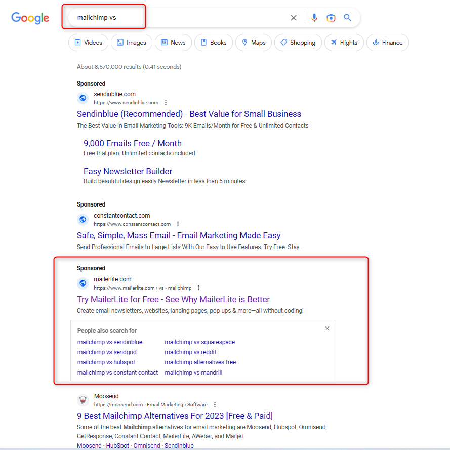
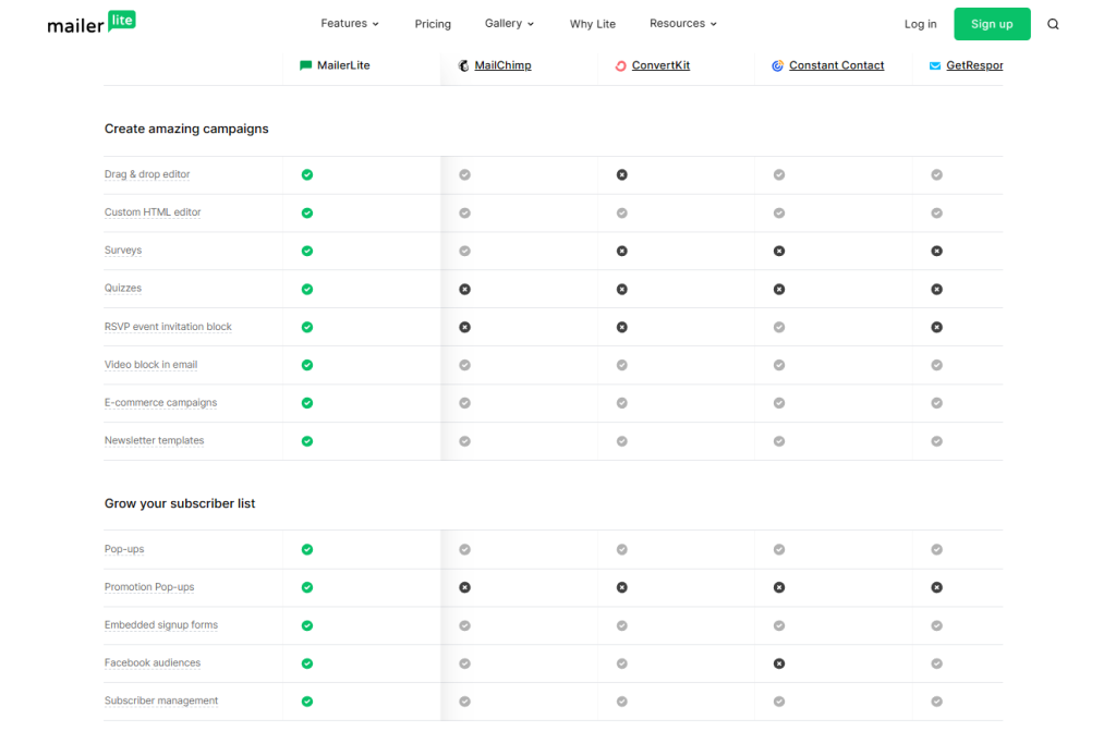
For example, the keyword “Mailchimp vs. ” will bring up the comparison page of MailerLite vs. Mailchimp.
Persuade
Once visitors have landed on your page, it’s your job to persuade prospects that your solution is the best choice for their needs. You can do this by highlighting your product’s unique selling proposition and demonstrating how it compares favorably to your competition.
Focus on Features that Highlight Unique Selling Propositions
Focusing on the benefits that set your product or service apart can effectively persuade potential customers. These may include unique features, better customer support, pricing advantages, and more integrations.
While it’s tempting to highlight every feature of your software, it’ll be too long to read. Instead, you should highlight only those features that distinguish your product in the marketplace.
Types of features to include:
- Features unique to your software
- Features that solve the primary customer pain points
- Features that create a better user experience
- Features that work differently from your competitors
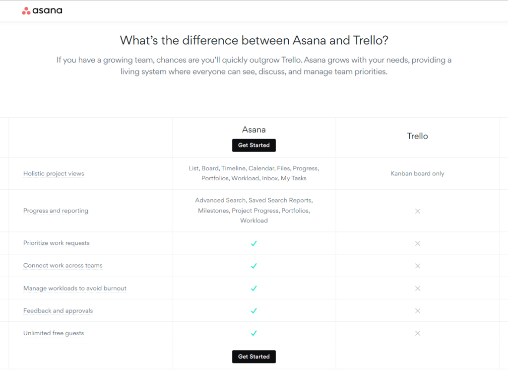
For example, Asana doesn’t list all the features in its direct comparison with Trello. Instead, it makes the case that it’s a better fit for those looking for a team-oriented solution.
They include only the features that would benefit teams, such as the ability to connect across work teams, multiple project views, feedback, approvals, etc.
Create a Side-By-Side Comparison Table
Everyone that lands on your page expects to find a comparison table. The table should provide a transparent and honest overview of both products. However, ideally, you want to keep it concise since long tables with a lengthy list of secondary features only create an unsavory reading experience.
But there are different types of tables depending on your product.
Short & Concise: Best used when you only have a few vital features to compare.
Long & detailed tables: useful when describing how your product offers way more features for a similar price.
Explanatory tables: Explanation of how your features are a value-added benefit compared with your competitors.
The copywriting for your comparison table is as important as the features you put in it. Specifically, the headline will set the tone of your comparison since it implants ideas on how readers should perceive your table.
For example, if your headline says, “Our product is cheaper than our competitor’s product,” it gives the impression that your solution is the better deal.
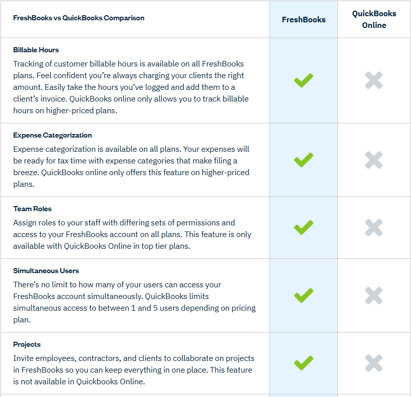
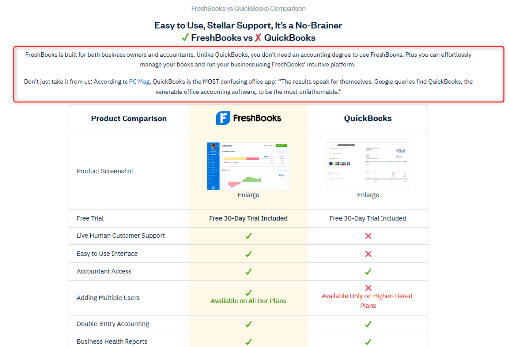
You can even add an entire text that supports your headline. For example, Freshbook explains how their product is easy to use, unlike QuickBooks, which is confusing and requires some accounting knowledge.
Convert
The ultimate goal of any comparison page is to acquire new customers. Conversion tactics such as CTA buttons help achieve this.
Add Call to Action Buttons
It’s best to use a softer CTA such as “Free Trial” or “Request Demo” since they don’t require a hard commitment to click on it.
Visitors on comparison pages typically search for alternatives, so they likely haven’t decided yet. Therefore, a “Buy Now” button may repel some visitors.
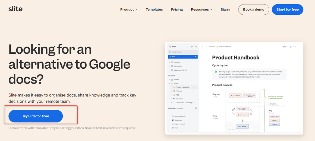
Slite uses the CTA “Try Slite for Free” and places it throughout their comparison page.
Include Customer Success Case Studies/Testimonials
Adding customer testimonials and success case studies can be a powerful way to build trust with visitors. They add social proof to your product, which can help overcome potential customers’ doubts.
The content of your testimonials should highlight your USP, unique features, user experience, or brand identity.
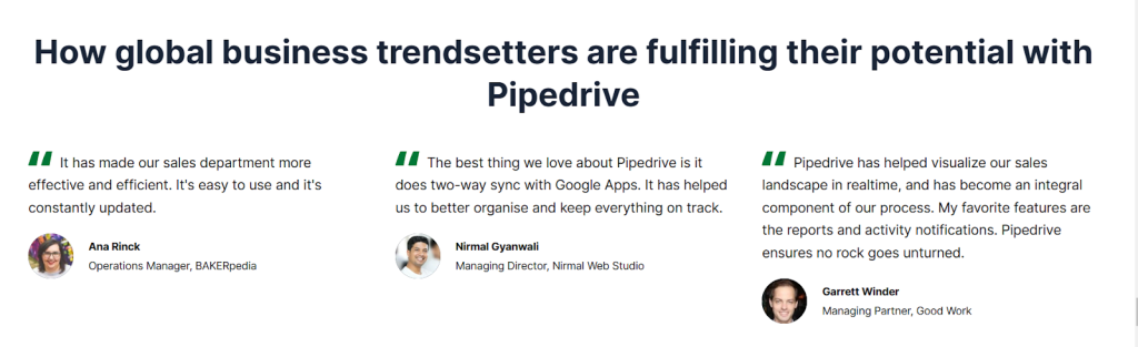
Most brands use text for their testimonials; however, videos can show authenticity. With video, it’s a good idea to summarize the video with texts, such as how Pipedrive has:
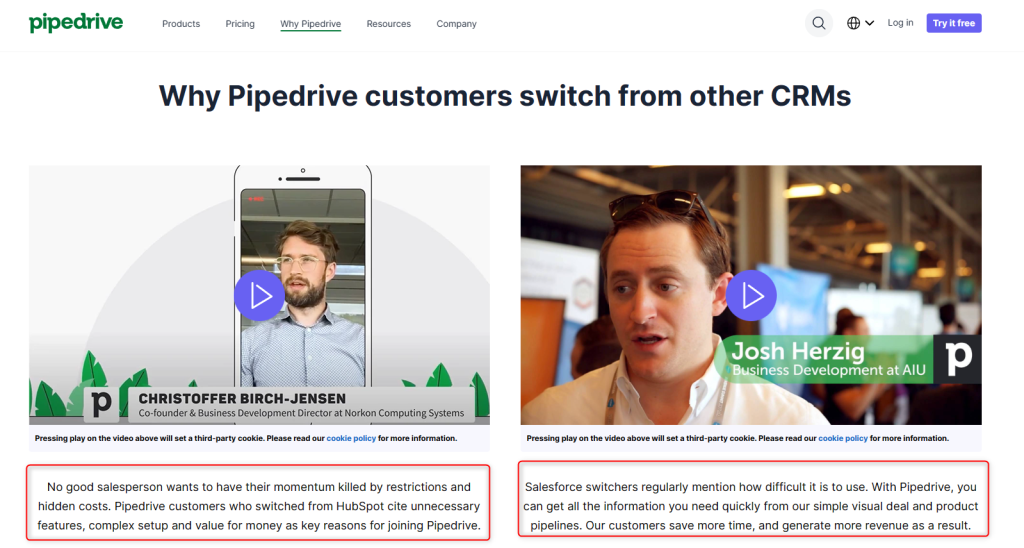
Some comparison competitor pages will have linked testimonials to case studies to showcase how the product or service was instrumental in achieving success within a particular industry.
If you’ve worked with big brands, flaunt them. Comparison pages are the perfect place to show off any celebrity customers you have.
3 Common Mistakes From Competitor Comparison Landing Pages
You know the dos, but it’s equally important not to make critical mistakes that will increase your bounce rate and allow your prospects to turn to your competitors.
Mistake 1: Don’t Trash the Competition
Fabricating your features and abilities leads to more churn. Before creating your comparison page, truly take the time to understand where your product fits into the marketplace and how you stack up.
For example, as a new SaaS business, you might not be the best solution. But are you cheaper? Is your product more user-friendly? Or perhaps your product offers more personalized support?
Ragging on your competition is a turn-off, and it will only lower conversion rates. It will also not reflect well on your brand.
Keep it informative and above the belt.
Mistake 2: Not Creating Comparison Pages All Together
However, the opposite is true. Many SaaS brands won’t create them because they believe it’s throwing shade.
Unfortunately, your competitors will do all the talking for you. They’ll present your product in a negative light, and you won’t have anything to say.
Furthermore, review sites such as Capterra and G2 may portray inaccurate information. Present your side of the argument so customers know why they should choose your product!
Mistake 3: It’s Not All About You
You want to stay objective and make an accurate comparison with your competitors. Do so by reporting facts about specific limitations, such as usage limits or a lack of critical features.
Using hyperbole by saying “we’re the best” isn’t going to help conversion rates.
Visitors are searching for a real comparison to understand which solution best suits their needs. It’s better to remain objective since you’ll be filtering out prospects who aren’t a good fit.
Specifically, tell readers who your product is for.
Convert More Customers with Killer Comparison Landing Pages
Comparison pages can be your dedicated salesperson who works for you 24/7. When optimized to include compelling copy and well-structured content, you have a high-converting machine that converts bottom-of-funnel prospects into new users.
Whether they’re looking for a better alternative to their existing solution or want a cheaper one, you’re there to inform and gently nudge the right prospects into your solution.
👋 Looking for input from a team that’s worked with category-leading companies – possibly like yours? We’re here and always happy to help! Use the contact widget in the bottom right-hand corner to get in touch or apply to work with us here.

Head of Content at ScaleMath, Justin brings more than 25 years of experience across education, technology, writing, and content strategy. A former Computer Science teacher, published author, and copywriting agency owner, he now leads content across the ScaleMath portfolio, shaping clear, accurate, and useful content for SaaS and technical audiences.