Building Your SaaS Website – Our Blueprint to Convert & Differentiate
Most SaaS companies design a website by:
- Looking at a handful of other websites from companies they admire.
- Syncing up with their engineering & design teams to create a combination of everything with the caveat that it should “just somehow match their brand”.
- Ship the site and adjust the copy to fit.
It even happens to the best of us.
Even if you have industry-leading engineers and designers on your team, the temptation to start by looking at what others have done for inspiration really is just too strong.
And there isn’t anything inherently wrong with doing that, as long as it’s backed by a proven blueprint that you’re applying to your SaaS business, product, and story.
At ScaleMath, we’ve driven growth for dozens of industry-leading software companies. We’ve been in business for coming up on 10 years – in other words, we’re not new here.
Over the years, we’ve noticed a number of common things that even industry leaders overlook when it comes to how they design (and build) their websites.
So, without further ado – let’s get started.
The Homepage
It goes without saying – your homepage is the most important (and almost certainly the most-visited) page on your website.
And I can confidently say that you know the basics of a SaaS homepage because you yourself use software (that isn’t your own!) as a part of your day-to-day work.
In any case, here are the fundamentals:
- Product Hook / Headline
- Social Proof
- Product Showcase
- Call To Action
- Value Proposition
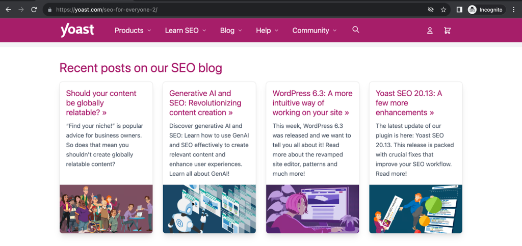
- 3 Core Blog Posts
- Testimonials
- Footer
But let’s break this down and talk about what sets apart the average homepage from one that drives interest, trust, and makes us want to convert.
Product Hook / Headline
You’ve probably heard of the phrase:
“80% of people read a headline, but only 20% read the rest.”
The truth is: nobody really knows where that statistic comes from, and nobody really cares whether it’s accurate because we know people have short consideration spans.
And your hook and headline serve you in one way – and one way only: to extend your ideal website visitor’s consideration span as much as possible.
Here are a few best practices for writing powerful headlines:
- Be extremely specific: you want to extend your ideal website visitor’s consideration span. Not anyone and everyone’s. Lean into what matters to the people you want and you know want what you have, not everyone.
- Grab attention: in other words, don’t shy away from being bold.
- Provide an instant benefit: lean into the pain point, doubt, objections, and advantages you can address.
- Separate yourself from competitors: don’t position yourself as an alternative or you’ll be seen as yet another option to choose from in what is already a sea of options.
Here’s an example of this in practice:
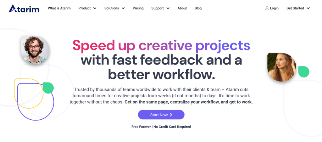
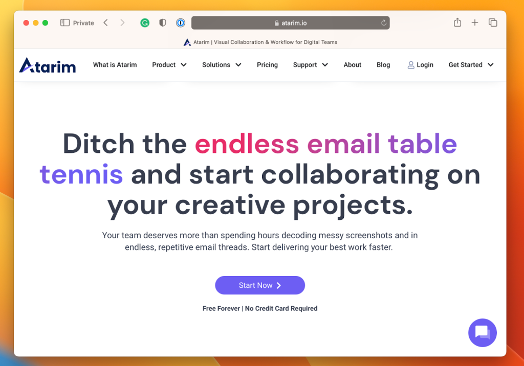
The hook and headline on Atarim’s homepage hits home for a few reasons:
- It’s bold: both the headline and hook grab visitor attention. We know the value of Atarim and it’s proven, so there’s no reason to shy away from that ‘speed up creative projects’ – which is pretty head-on in terms of what people say they come to Atarim for, and what they achieve once they start using Atarim (as opposed to the sticky-tape solutions they used before).
- It’s clear: although not everyone will get absolutely everything about what Atarim can be used for at first glance, that will never be the case in a single headline. Your headline and hook isn’t about explaining exactly what your product does in as much detail as possible in as few words. You won’t win any awards for doing that. Instead, focus on distilling the value of the product, and include enough clarity to extend your website visitor’s consideration span to read the next line, and then the next line (on repeat).
- It sparks curiosity: gets people who are potential customers interested enough to want to learn more about what Atarim is, what it does, and how it does it.
Social Proof
After your product’s hook and homepage headline, you’ve established what you do, and that message should be clear.
Now you want the people browsing your site to know they’re in good (if not great) company, to keep them interested.
There are different types of social proof, including:
- Expert’s Stamp of Approval
- Review Sites (Truspilot, G2, etc.)
- Case Studies
- And, of course, Social Media Posts / Testimonials: but we more specifically group these under “testimonials” rather than social proof, which we’ll cover later on.
Note: All of these go hand in hand. Just because you have one doesn’t mean you can’t – or shouldn’t – use another.
Here’s an example of this in practice:
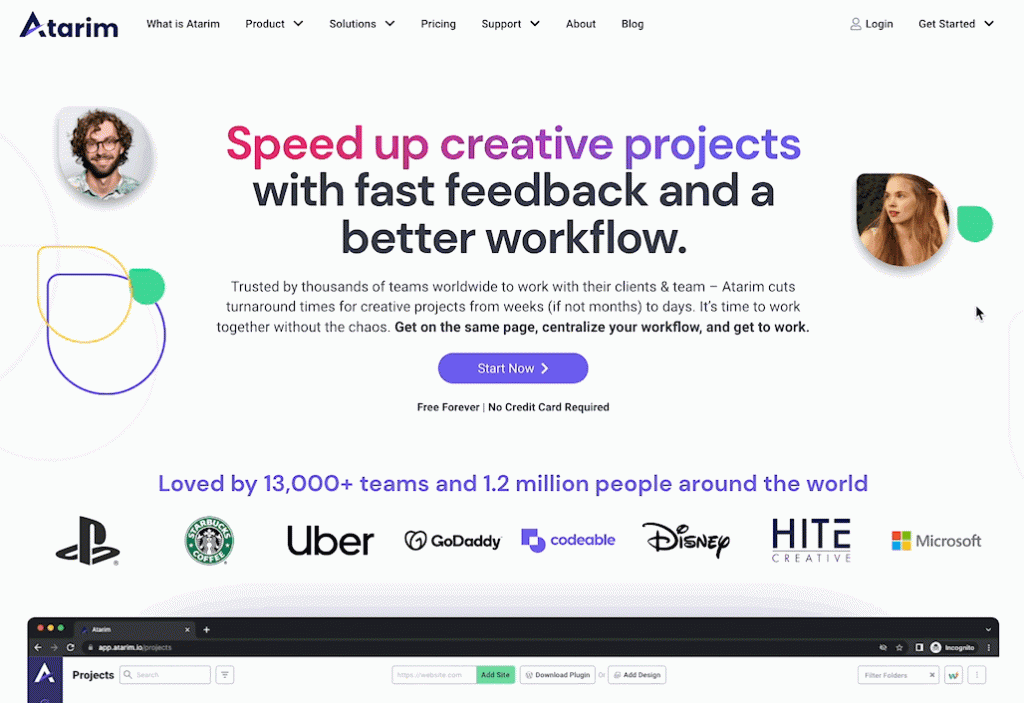
The most common approach to this is including a banner that features some of the most well-known brands that already use and rely on your product:

Unsurprisingly, this works really well for Atarim, given that brands such as PlayStation, Starbucks, Uber, GoDaddy, and Codeable – which span across a diverse set of industries – already use and trust Atarim.
This acts as an immediate signal to customers that Atarim is the go-to solution for these teams to work on visual projects together, since the teams at these companies are incredibly well-respected in the community. This is strengthened by the fact that it is very unlikely that any competitors are going to be able to legitimately feature social proof like this. In the case of Atarim, they were a first-mover in the visual collaboration space, so they are able to benefit from this especially (most competitors are small, hacked together side projects).
In short, the goal of social proof is to evoke the feeling of:
If you aren’t using it yet, you’re missing out.
Or, perhaps better yet:
“Oh, ScaleMath uses this product? Interesting – they’re quite similar to us – I want to find out more…”
Aim to add social proof early on your homepage. This should ideally be above the fold so that people see it without having to start scrolling (at the very least on desktop, on mobile this can be difficult to achieve).
Product Showcase
Featuring your product isn’t something you do on a section of your homepage (among other pages).
It’s something that should be woven into the entire design of your product’s marketing website.
From initially landing on your site, you want it to be as clear as possible to visitors what your product is, what it does, and what the value proposition is to them.
And once you’re past that… people want to know what the product they’re considering buying (or starting a trial for) is going to be like to work with.
- Will they like working with it?
- Will it be easy and enjoyable to work with?
- How does it compare to the 10 other solutions they’ve tried?
Simply put, they want to know as much as possible about the solution they’re yet to use in order to make a judgment call as to whether it is worth trying.
And a big part of this is allowing parts of your product to shine through on your marketing site. The extent to which you do this is obviously going to depend somewhat on the type of product you’re building, and how much you can and want to share. Ask yourself – are you operating on a self-serve model, or do you have a product that needs to be introduced through a video demo before a prospect would be able to see the value?
Sidenote: in most verticals, design & UI play a crucial role in a buyer’s decision-making process, but there are obviously exceptions where people don’t really care as much about a product’s interface, experience, etc.
There’s more than just one way to showcase your product:
- Feature a video walkthrough
- Feature showcase cards, lists, sections, etc.
- Interactive/usable product demos
Let’s take a look at a few examples of each of these ways.
#1 – Missive
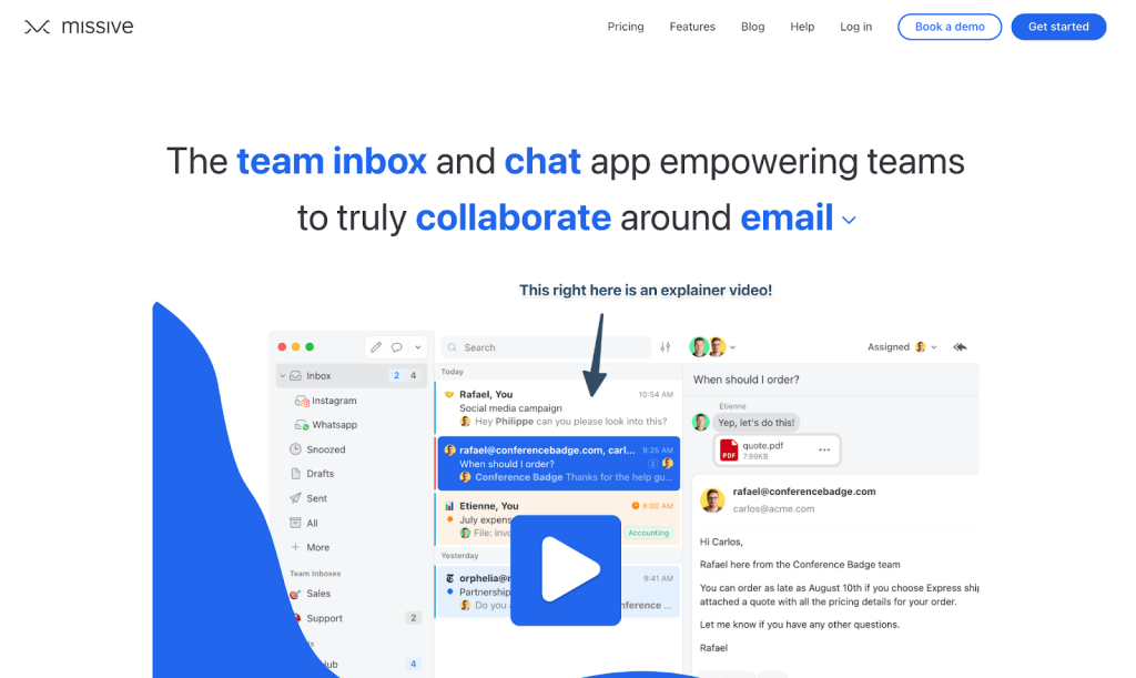
First off, we have Missive.
Now, it certainly helps that Missive is one of our favorite products – one we use and rely on at ScaleMath.
Their homepage is a great example of one that features a video demo.
#2 – Workover
And next up we have … Workover.
This is a software product that is yet to launch publicly so the images below are mockups / just for demonstration purposes.
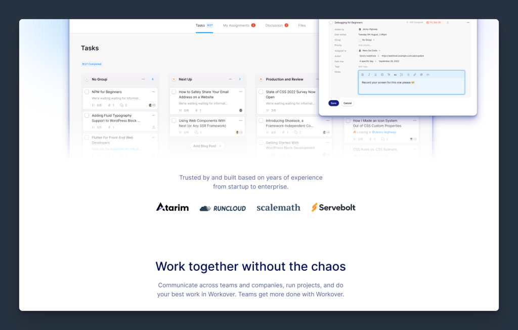
I wanted to include these because I think they are an exceptional example of how to showcase feature cards in what is both an incredibly aesthetically pleasing way as well as one that breaks down at a glance how different areas of the product work.
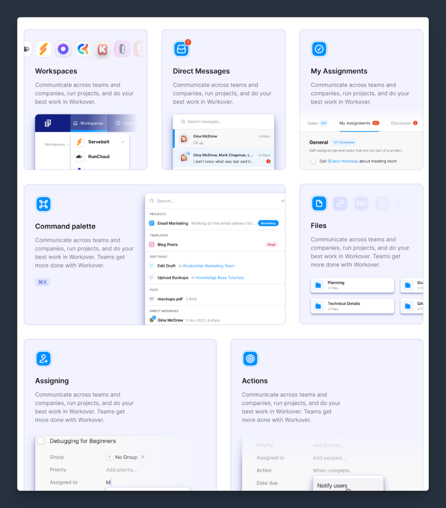
The product’s UI forms a big part of the entire homepage, rather than just specific sections. This is done to the point where it creates a cohesive experience between the marketing site and the product itself.
Sidenote: The copy in the above example (for Workover) is tentative, but you always want to make sure that when introducing “features” or “things your product can do” you do so in a way that also communicates the value of what your solution aims to help your ideal customer profile achieve.
That said, there are certainly easier ways of featuring your product that are less reliant on your team being able to design and ship a more nuanced design:
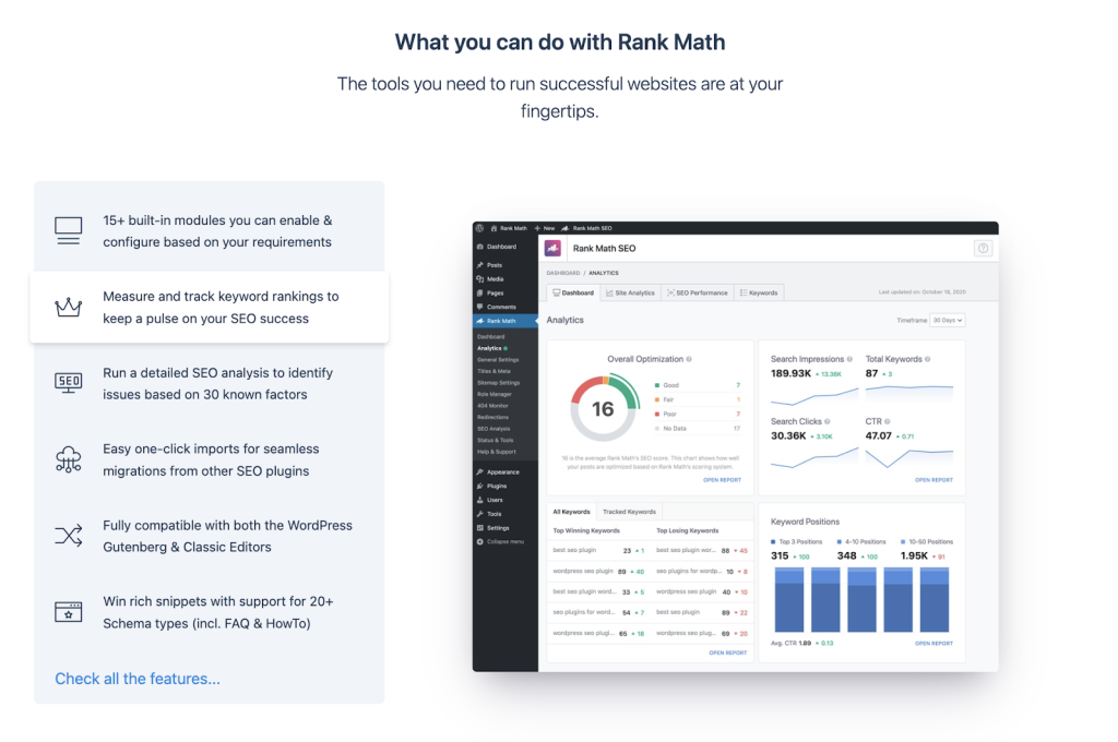
#3 – Atarim
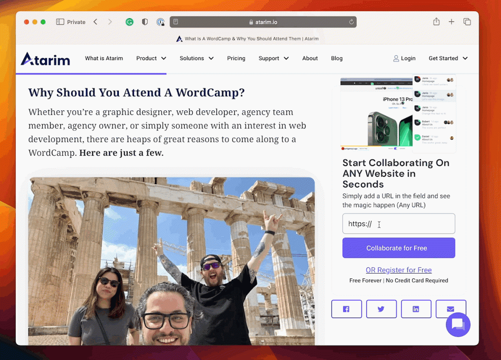
Our final example is one of the most difficult ones to pull off correctly – interactive product demos.
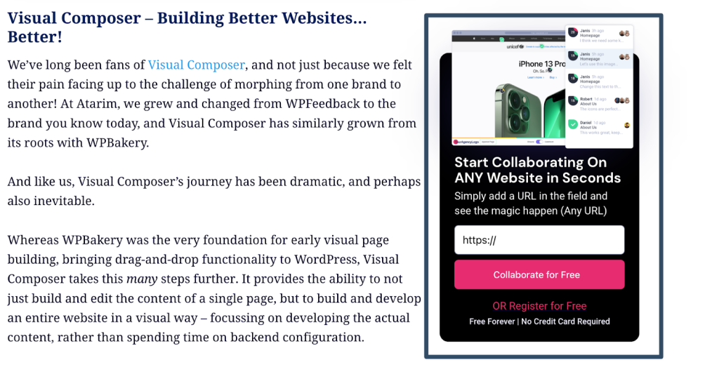
This involves enabling a limited experience with your product that users can take advantage of without having to log in. This enables them to see just enough value of what your product can do to the point where they want to take the next step – whether that is:
- Booking a demo
- Starting a trial
- Creating their free account (if you have a free plan)
Lead Magnet / Call To Action
We often see lead magnet call-to-actions excluded from SaaS homepages altogether, and they are a huge missed opportunity.
Most people will not create an account immediately.
Most people will not fill out a form to book a demo immediately.
That doesn’t mean they’re lost, and it also doesn’t mean they aren’t qualified prospects. This is just the nature of selling software.
Especially if you’re selling enterprise contracts (i.e. anything above 5-10k per year)…
- The buying decision starts to get more complex.
- More people are involved in the decision.
- The sales cycle is a lot longer (which is characteristic of B2B software in general).
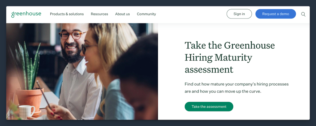
This is something your homepage should cater to, with a call to action that is something that leads to helping prospects make the right decision (instead of just offering them a trial).
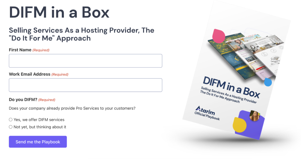
For example: Reports (on the industry, i.e. an applicant tracking system could do a “State of Hiring Remote in 2023”).
Your Value Proposition
A value proposition is exactly what it says it is – the value your product brings to the table.
It’s usually a short statement that helps customers understand how they can benefit from buying your products (and that they can’t possibly manage without it).
The ideal value proposition includes all of these qualities:
- Relevancy
- Specificity
- Differentiation
Why should customers sign up with you instead of with one of your competitors? You should make it very clear in your value proposition statement.
Be specific and provide relevant information your potential customers are interested in.
Here are some of our favorite SaaS value propositions.
(Our value proposition statement is based on all these qualities.)
We first established what we do, provided the benefit of delivering best-in-class content, and finished up with the words “other agencies can’t”.
It’s super-clear to see what we do, why you should choose us, and that we are better than competitors.
It can be as simple as that – one to two sentences is enough.
3 (Or More) Blog Posts
Here’s a great example from Yoast’s homepage:
Testimonials
If a friend recommended a product you need, you’d probably buy it, right?
Well, that’s the impact a testimonial has on customers. Data shows that most consumers trust user reviews as much as personal recommendations.
That’s how big of an impact testimonials have on your conversions.
It’s essential to include them in your website, together with the social proof I mentioned earlier. The biggest advantage of testimonials is that they are relatable. They provide more insights about your SaaS business from the perspective of the customer.
(And they can help assure potential customers that your tool can really help them.)
Here are some of the most important parts of a great testimonial:
- Full name
- Company
- The review
- Profile picture
- Contact details
Also, be sure you ask your customers if they are happy with you sharing their testimonials, coupled with their profile picture and name on your website.
Never put a testimonial on your website before asking.
You can see a few testimonials from customers of Atarim. As you can see, all of these testimonials highlight important qualities you’re looking for in a business.
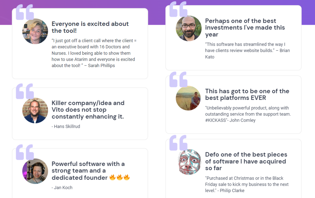
Also, ideally, you’d link your testimonials to your banner social proof.
(In the example above, all of these testimonials are from companies that are included in their banner.)
How It Works
A “How It Works” or “Features” page is one of the key pages of every successful SaaS website.
We’ve touched on the features of your product in the homepage part a bit, but that was just the tip of the iceberg compared to this page.
Here you’ll dive deeper into every important feature your product has, and give a detailed explanation of each.
Keep these in mind when designing your How It Works page:
- List the best features
- Add crystal-clear headlines
- Describe by using benefits
- Talk about the use cases
Every feature should be relatable – a potential customer must know immediately how and why to use it.
Real-Life Example:
There are many different designs for listing features.
The easiest one you can do, which is very common for many SaaS businesses, is to create a grid. You add a small icon, a headline, and a description.
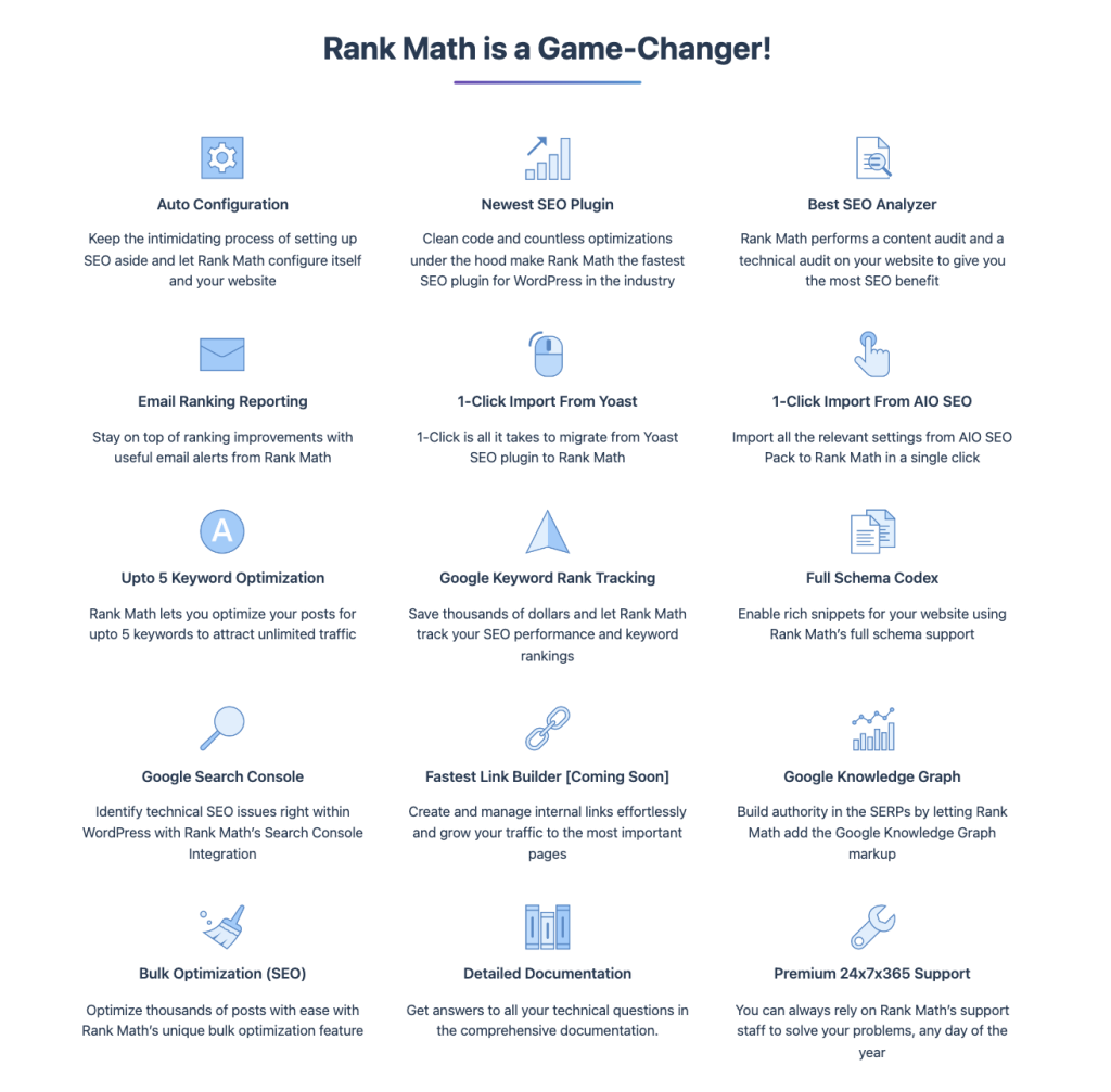
This makes it very clear to see what each feature is about (and whether the product is the right fit for your business).
Who’s It For (Use Cases)
Feature pages help potential customers see whether they need your solution or not.
If they do, you need to show them how they can use your product to improve their business to reach their goals faster. The Who’s It For page does exactly that by showing your product in use…
..and making it relatable to a potential customer, too.
Here’s an example of this in practice:
Rank Math created a specific page for only one purpose – to convince customers they need their solution.
And it worked!
They included a catchy headline for each feature you’ll get, plus a description of why you need it coupled with a screenshot of the tool in action.
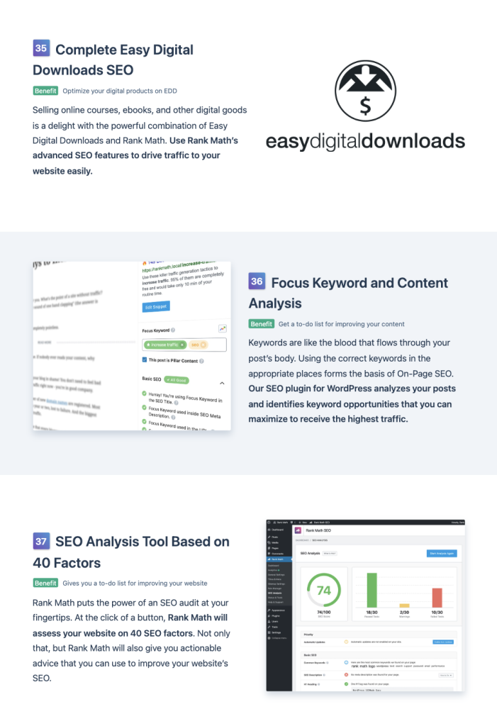
This allows customers to know exactly what to expect after they buy the product.
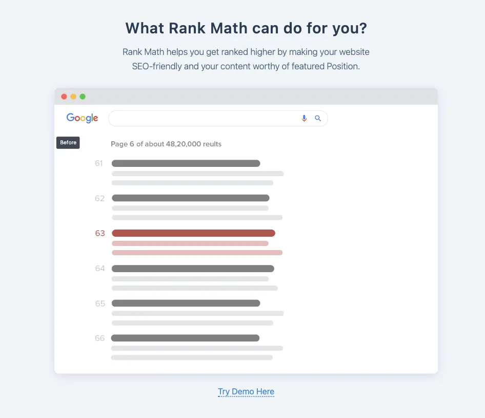
To reassure potential customers even more, they offer a demo version of their product, so they can experience it directly themselves.
The Pricing Page
A pricing page is a landing page that lists different pricing plans available for your products and services. Many SaaS businesses just slap different packages on their pricing page and forget all about it. But there’s a lot that goes into pricing strategy.
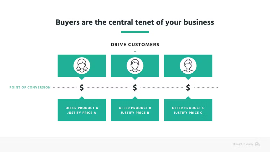
Our friends over at Paddle have a great resource on the topic of pricing strategy, which I highly recommend checking out: The Pricing Strategy Guide: Choosing Pricing Strategies That Grow (Not Sink) Your Business.
This strategy works extremely well with SaaS products because you can bundle a variety of features and services in different packages.
You have to realize that not every customer uses your tool to the fullest – some need only a few features…
…and that’s precisely why tiered, usage-based, and seat-based pricing strategies need to be explored. And, of course, the one that’s most relevant to your product varies depending on what it is that your product does.
Here’s an example of this in practice:
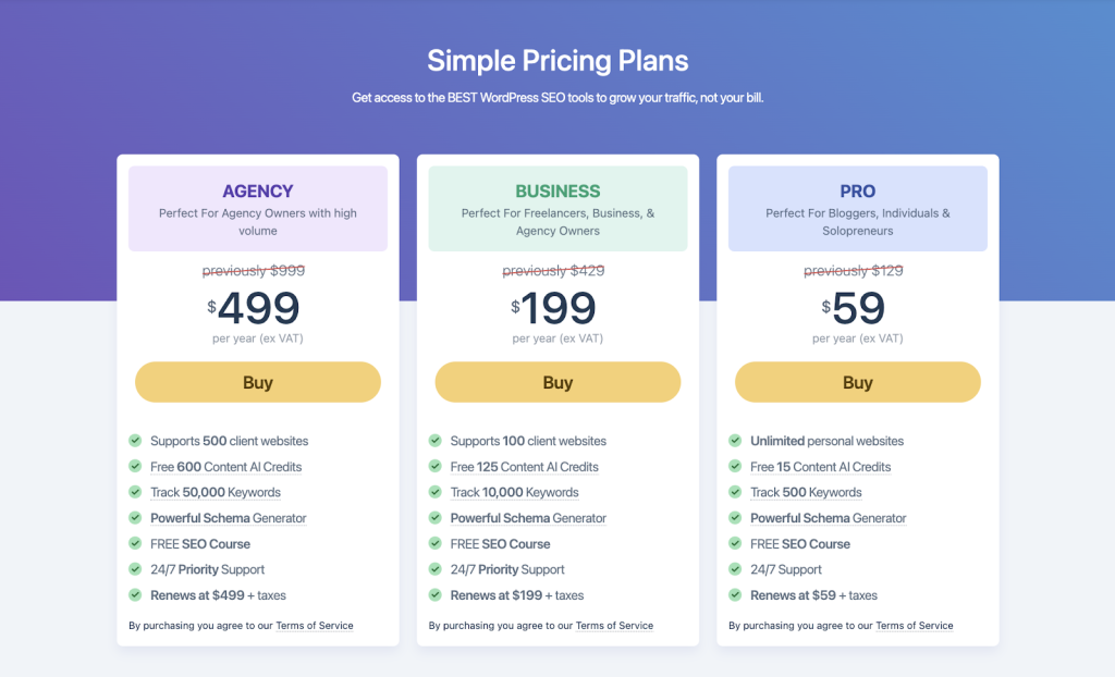
Rank Math implements multiple sales strategies on its pricing pages to improve the conversion rate. First, they have a solid three-tier pricing model in place.
It’s immediately clear what features you get with each of the packages, as well as who these packages are best suited for.
Second, they have a social proof banner below the pricing plans to reassure you that they will deliver.
Plus, this increases the value of their products too!

Thirdly, their prices end with a number nine, which is a sales technique called a “charm price”, and makes the prices look lower than they are.

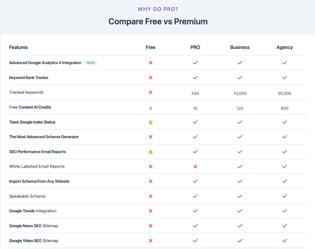
Also, they do an in-depth comparison of each package just below the pricing.
This is essential, and lets potential customers know exactly what they’re getting, and be able to distinguish the packages from one another.
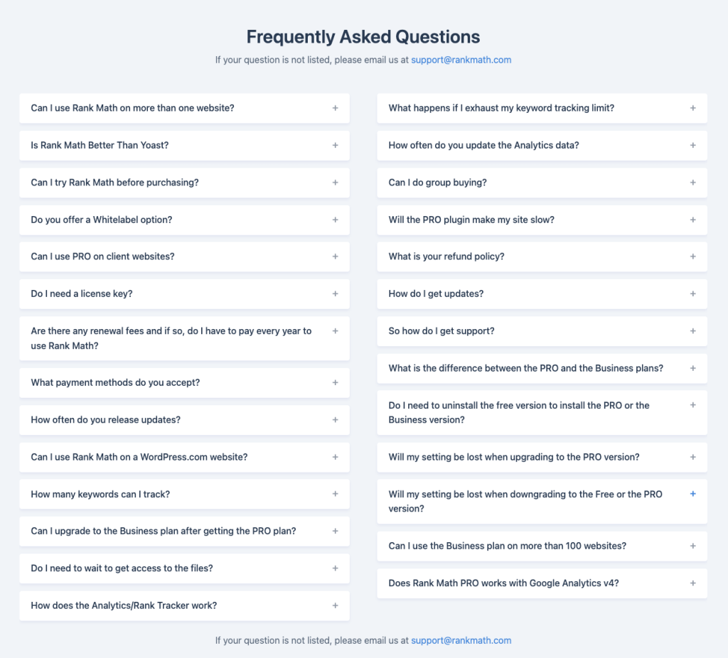
Rank Math also knows that customers must overcome every objection before they buy.
And that’s why they added a Frequently Asked Questions section to the bottom of the page to answer any questions customers might have, and make them ready to buy.
It’s an extremely powerful pricing page, implementing all of the critical tactics for maximizing sales. Be sure to include all of these elements in your pricing page too.
About, Why Us, & Origin Story
The About Us, Why Us, and Origin Story pages are what gives your brand a personality, and differentiates it from any other company on the market. Unfortunately, most SaaS businesses overlook these pages because they don’t understand their importance.
But if done correctly, they can elevate your business and help you stand out from competitors.
Here are a few of the qualities that each of these pages should carry:
- Authenticity
- Uniqueness
- Transparency
Avoid putting hype and sales pitches inside these pages at any cost.
Just imagine getting to know somebody, and the first thing this person does is immediately start selling to you, instead of introducing themselves.
Let’s break this down with an example:
Atarim made these pages completely irresistible.
The first thing you’ll want to have when you land on the About page is a picture of the leadership team, and the rest of the team.
This adds a personal touch, and makes customers feel as though they’re not talking to a huge company, but rather to a real person. It puts a face to your SaaS business.
The headline clearly states why they started the company and separates them from competitors.
If you read the description, you’ll see exactly what their struggle was, the challenges they faced, and what problems they fixed.
It’s authentic, personal, and very relatable for their potential customers.
If you scroll down a bit further, you can see their missions, as well as a little bit of behind-the-scenes information about the team behind the company.
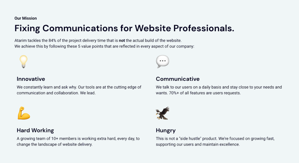
Then it starts to get a lot more personal – diving deep into a detailed story behind the brand. It’s extremely authentic, which is what your goal should be with these pages.
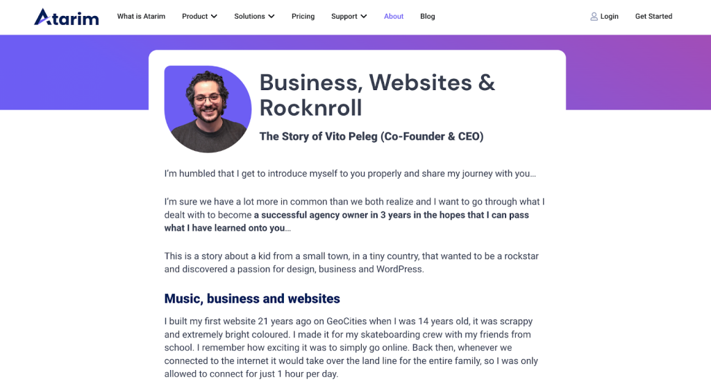
It features all of the important qualities we’ve talked about – authenticity, uniqueness, and transparency. If your pages lack these qualities, you should definitely do something about them. Get inspired, think about the story behind your brand, and let your customers know about it. It’s one of the most important pages needed to position the company and product you’re building into a certain market segment, and differentiate it from the competitors.
Another great example of an About page from one of the most mature companies in software is Basecamp’s – with their page being a letter from Jason Fried, the company’s founder & CEO.
Blog & Individual Blog Post Pages
If you’re reading this, you likely know that beyond the core pages of your marketing site, the blog feed and individual post pages are absolutely essential components.
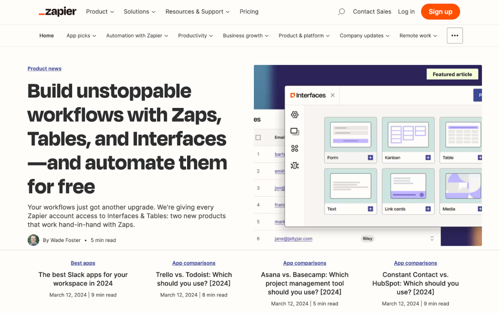
They’re where most of your traffic is going to come from – whether it’s from content that’s published to educate customers, provide updates, or inform the readers about relevant topics in the industry (that allow you to feature your product).
And most people like to think that design can be an afterthought here. Let me burst that bubble right now – it absolutely cannot and should not.
In fact, people landing on these pages typically come from sources that mean they’ve never heard of you before, and so it’s your brief chance to make a lasting impression and earn their interest, trust, and ultimately their desire to explore what your product does.
Here are some of our favorite blog & individual blog post pages:
In terms of content, you’re welcome to get in touch. You can write to me personally at [email protected] with any questions. We also have some great resources – all of which center around our principles of high-quality content:
- Truly get your reader.
- Fully grasp the topic.
- Find your why for this topic.
- Model content structure around information readers want.
- Build trust with the audience.
More in our guide on how to produce high-quality content.
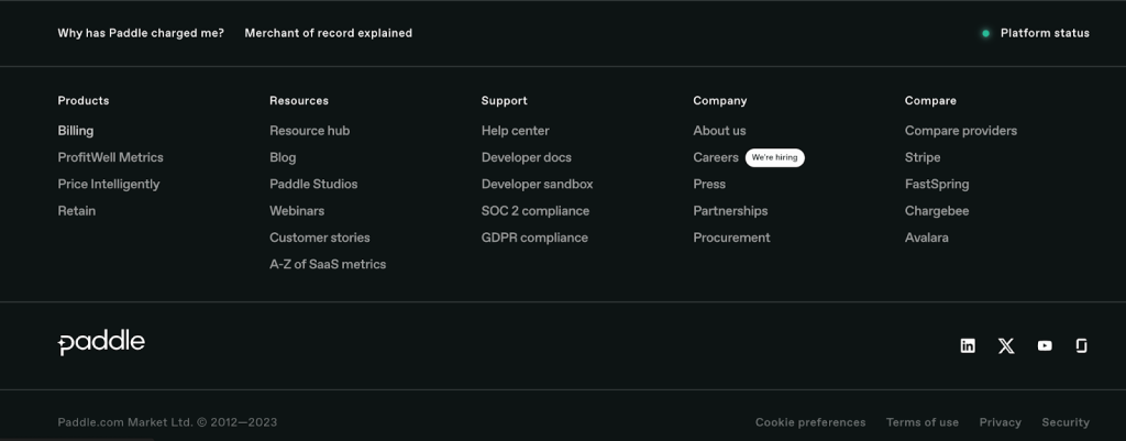
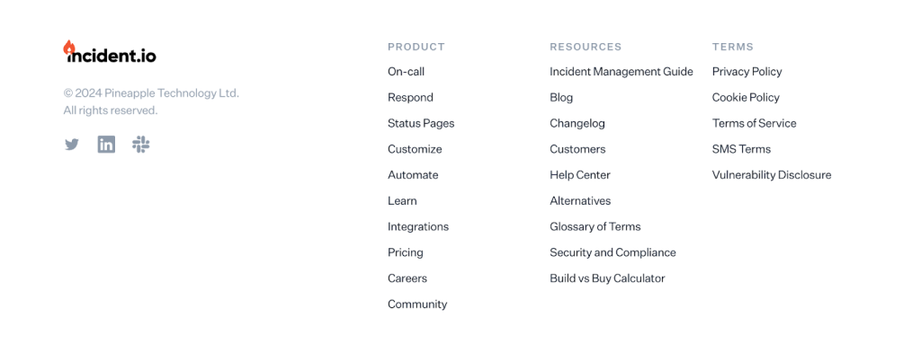
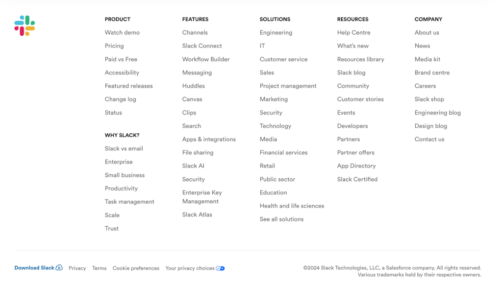
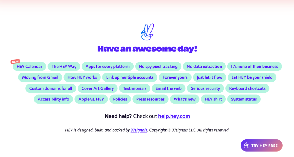
Footer
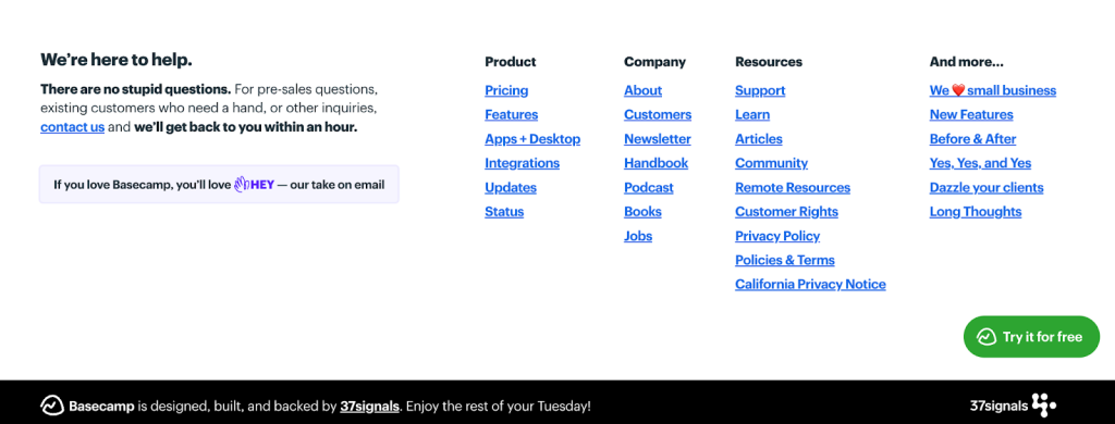
Next up, we have your website footer.
Another easy-to-overlook component where a little love goes a long way.
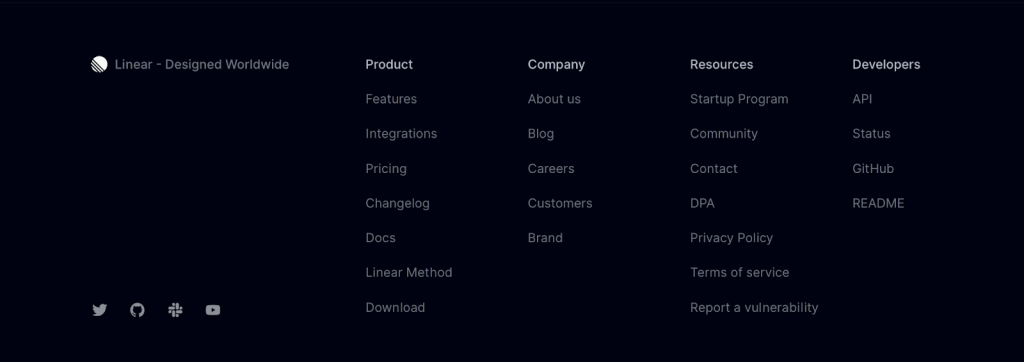
Your footer is what’s at the very bottom, of course, and on a fundamental level should include the following:
- Social media
- Site navigation
- Copyright
- Terms & conditions
- Privacy policy
You can also put a short About Us section there. There’s not much to say in terms of guidance as to what makes a good footer, besides the fact that getting the details right matters. But instead of leaving it at that, here are some examples that we like:


Other Notes, Thoughts & Considerations
Note: This section is a work-in-progress and we intend to continue adding guidance here as we continue to come across additional scenarios worth considering
#1 – Long-lived promotion/sales pages
When you finish running a sale, delete the page and redirect it back to your pricing page.
Save yourself from ending up with 100s of random webinar/sales pages on your site that add no value, mostly have the exact same content, and bloat your site with low-quality content.
#2 – Any other questions you think we should answer here? 👀
Tweet @alexjpanagis or shoot me an email to [email protected] – happy to help.
After Action Report – Convert More Visitors From Your Ideal SaaS Website
Beyond design and attention to detail, there’s a lot more that goes into a great marketing site that’s specific to your business and product – guidance that simply isn’t possible to distill into a single blog post. Simply because, doing so requires a deep understanding, and focusing solely on the product and its ideal customer profile – as opposed to offering guidance that’s useful and applicable to largely every software company out there, especially those operating in B2B SaaS.
If you want to get us involved in product strategy, copywriting, positioning, and beyond – drop us a line anytime (send an email to [email protected]). After all, we’re the go-to partner for some of the world’s leading companies (including likely a handful of your personal favorite SaaS companies) – and for a good reason. 🙂
Defining What Success Looks Like
The success of your software company’s marketing site isn’t something you can visit once and then consider it to be done. This is going to sound super cliché, but your website should be a living and breathing asset that serves dozens of purposes.
Ship V1, don’t procrastinate, and be efficient about how you do it. Then, focus on ongoing improvements that you ship over time (without disrupting your product team).
You need to get your team to the point where experiments and improvements can be run on the marketing site without the team that’s working on your core product being pulled into things (at least not so often that it would start to slow them down, of course).
- Run message testing with Wynter: pay to run your website positioning, messaging, and design by a hand-picked panel of customers that fall into your target demographic. Ask them specific questions to help direct ongoing improvements.
- Interview customers: speak to people! Use sales calls and demos to gauge how well people get what your product does based on your website.
- Measure hard numbers that you can track: not everything can be measured, but that doesn’t mean that you shouldn’t measure what you can.
- Sponsor a conference: this is by far the most revealing way to get feedback. Wynter is a really great and more affordable way to do this, but being able to attend conferences, run a sponsor’s booth where people come by and then ask questions is incredibly valuable. The majority of the language they use is stuff that can be used directly in marketing copy, address objections, and get feedback on whether or not the current version of your site communicates what you want it to.
Again, we hope this detailed guide makes it significantly easier for you to ship V1 of the marketing site for your SaaS product.
👋 Looking for input from a team that’s worked with category-leading companies – possibly like yours? We’re here and always happy to help! Use the contact widget in the bottom right-hand corner to get in touch or apply to work with us here.